Welcome to Circular progress bar android Tutorial. In android development Progress bar is widely used and in many forms but one that is arguably the most loved is “Circular Progress bar with text”.
If you have been in android development for even a couple of months you have at-least once wondered how can I get a progress bar with text progress well you are in luck cause we are going to do just that in this tutorial as shown in picture and possibly a little more.
Circular progress bar with text in android is pretty easy to make and takes like 4 easy steps to do just that but before we dive right in let’s take a look at what it actually is.
What is a Progress bar?
An UI element that signifies that a process is executing and shows progress as its name would suggest. Progress bar in general supports two modes to represent progress.
- Determinate (By Default Linear)
- Indeterminate (By Default Circular)
Indeterminate Progress Bar
One example of this can be the very default Progress Bar we have now the circular motion with an animation we can consider using these kinds of Progress Bar when an operation under execution and we wouldn’t know how long that would take.
A great and most familiar example of this can be an api endpoint call we would not know what can happen until we get a response. Using an indeterminate Progress Bar here makes sense because of the uncertainty.
Determinate Progress Bar
These are progress bar that are for task that are somewhat known to us for example can be how long it will take to download a file from the server. These are recommended to use in applications where these tasks are for the users to see along with the progress.
A default Determinate Progress Bar is a linear line which can be set Progress on dynamically and can be hardcoded too (but that wouldn’t make much sense)
Note: While the default types of these are circular and linear it doesn’t mean a Determinate ProgressBar cannot be circular and vice-versa
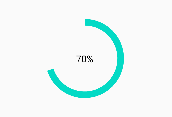
What exactly are we going to build?
To answer that we can refer to this picture
and also this optionally
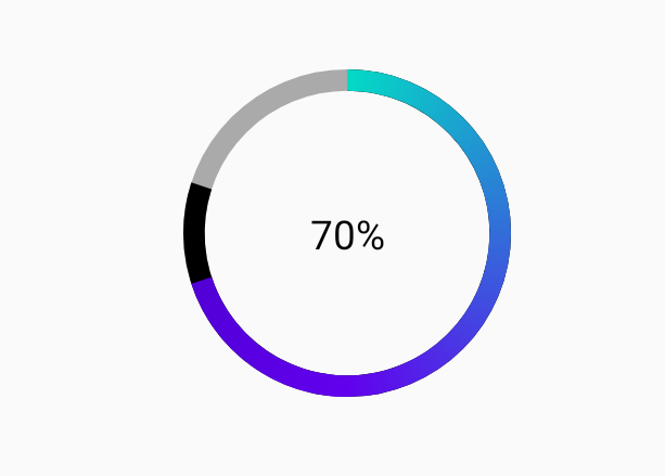
this can be called as a circular determinant progress bar with progress on it shown with help of a TextView centered in between
We could also go ahead and create a custom view to do this but for making this tutorial a bit more easier we are going to use another approach.
Prerequisites
- Android Studio
- Basic Knowledge of Android Views
- Kotlin Basic Knowledge
we can use both an activity or a fragment here. So let’s start with the steps right away !
Creating the View
Here we have used an activity to create this view which has a constraint view as its parent
|
1 2 3 4 5 6 7 8 9 10 11 12 13 14 15 16 17 18 19 20 21 22 23 24 25 26 27 28 29 30 |
<androidx.constraintlayout.widget.ConstraintLayout android:layout_width="match_parent" android:layout_height="wrap_content" android:padding="20dp"> <ProgressBar android:id="@+id/circular_determinative_pb" android:layout_width="150dp" android:layout_height="150dp" android:indeterminateOnly="false" android:progressDrawable="@drawable/pb_circular_determinative" app:layout_constraintBottom_toBottomOf="parent" app:layout_constraintEnd_toEndOf="parent" app:layout_constraintStart_toStartOf="parent" app:layout_constraintTop_toTopOf="parent" /> <TextView android:id="@+id/progress_tv" android:layout_width="wrap_content" android:layout_height="wrap_content" android:textColor="@android:color/black" app:layout_constraintBottom_toBottomOf="@+id/circular_determinative_pb" app:layout_constraintEnd_toEndOf="@+id/circular_determinative_pb" app:layout_constraintStart_toStartOf="@+id/circular_determinative_pb" app:layout_constraintTop_toTopOf="@+id/circular_determinative_pb" tools:text="50%" /> </androidx.constraintlayout.widget.ConstraintLayout> |
this should look like this in the design tab
this is not even close to what we want but we are only halfway now
it is clear that there is an error that is because we haven’t yet created the file pb_circular_determinative.xml so let’s do it.
Creating the Drawable Resource
You just need to create a new file inside drawable folder. So just right click -> new -> drawable resource file.
here we are using a layer-list because it is used to setup multiple items together one over the other however in layer-list an item placed on the top stays on the bottom so we must keep this in mind while designing the drawable
Add a background for the progress bar(optional)
|
1 2 3 4 5 6 7 8 9 10 11 12 13 14 15 16 17 |
<?xml version="1.0" encoding="utf-8"?> <layer-list xmlns:android="http://schemas.android.com/apk/res/android"> <item android:id="@android:id/background"> <shape android:shape="ring" android:useLevel="false" android:thicknessRatio="20" > <solid android:color="@android:color/darker_gray"/> </shape> </item> </layer-list> |
now that we have made this let’s look at what each part does the “id” item tells the android system what kind of item is this so that if you apply a tint for background it gets applied to this only, “shape” defines what shape we want and “thicknessRatio” sets the thickness of the ring according to the size of the shape, “useLevel” however is the attribute that helps the system understand that if the drawable will grow with progress so for the background we set this to “false”
Now lets create the main progress drawable
|
1 2 3 4 5 6 7 8 9 10 11 12 13 14 |
<item android:id="@android:id/progress"> <rotate android:fromDegrees="270" android:toDegrees="270"> <shape android:shape="ring" android:thicknessRatio="20"> <solid android:color="@color/colorAccent"/> </shape> </rotate> </item> |
here we need to add an item that says that it is progress by setting its item id to progress we start this drawable with a rotate tag as the contained shape by default starts from the right side which is not visible in the background but will be visible here
toDegree and fromDegree tell the contained shape to rotate 270 degrees to the right side which brings it to the top
shape defines what shape we want and thicknessRatio sets the thickness of the ring according to the size of the shape
here we have skipped using useLevel that is because we have set the id to a system id in this item and this will automatically set the progress on the shape
Customizing the shape color
To change the color of the shape we can add gradient instead of a solid like this
here we use the type attribute to set how we want the color to change which in this case is only suitable in sweep other alternatives do not do with the circular pattern and this one is just what we need
|
1 2 3 4 5 6 7 8 9 10 11 12 13 14 15 16 17 |
<item android:id="@android:id/progress"> <rotate android:fromDegrees="270" android:toDegrees="270"> <shape android:shape="ring" android:thicknessRatio="20"> <gradient android:type="sweep" android:startColor="@color/colorAccent" android:centerColor="@color/colorPrimary" android:endColor="@color/colorPrimaryDark" /> </shape> </rotate> </item> |
Add a customized secondary Progress bar (Optional)
|
1 2 3 4 5 6 7 8 9 10 11 12 |
<item android:id="@android:id/secondaryProgress"> <rotate android:toDegrees="270" android:fromDegrees="270"> <shape android:thicknessRatio="20" android:shape="ring"> <solid android:color="@android:color/black"/> </shape> </rotate> </item> |
Here we are going to add another item in between the background and progress item so that it stays in between them while it is visible now in this one we have only changed the id and its position is between the 2 items you can also decrease the thicknessRatio to make it visible from behind the main progress now that we are done with our drawable resource lets test it
Testing the View
To test this setup we move back to the layout and set these attributes in the ProgressBar tools:progress=“70” and change the progress in the Textview text to 70%
and if you have been following optional steps to add secondary progress bar also add tools:secondaryProgress= “80”
case you have followed only required steps your view must look like this
and in case you have also followed the optional steps it should look a bit like this.
although we have almost completed our view a progress bar is incomplete without having functionality to set a progress dynamically.
Setting up the progress bar for dynamical use
|
1 2 3 4 5 6 7 8 9 10 |
fun setProgressTo(progress: Int){ progress_tv.text = "$progress%" circular_determinative_pb.progress = progress } fun setSecondaryProgressTo(progress: Int){ circular_determinative_pb.secondaryProgress = progress } |
An easy way to make changes from within the activity can be to set a progress bar helper method you can use this to set the progress from within the activity at any time and for both the progress at any time.
And that is all we need we can use this progress bar to set a dynamic progress in a circular manner and with a text to show progress.
Conclusion
So that is all for this Circular Progress bar android Tutorial friends. I hope I taught you something new with this post. And if you think it is really useful then please support me by sharing this post with your friends. Thank You.